ShopDreamUp AI ArtDreamUp
Deviation Actions
Description
As an autistic person, I've not cared much for the many attempts at creating a symbol that represents autism or the autistic community.
Obviously no symbol is going to be loved by everyone, however in the autism community there has yet to be a single symbol that's widely supported or recognized. Many people have tried, but none have managed to capture the imaginations of the wider community.
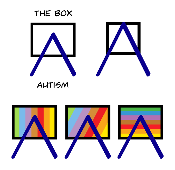
Thus far we've got one idea that is widely accepted as indicating autism, and that's the multi-colored puzzle designs and maybe the puzzle ribbon, but I have my doubts. As I see it the puzzle designs have several problems. I think a design like this one (if not this one) can overcome all of those problems.
 Simple: A multi-colored puzzle design is visually complex and that makes it difficult to create, transfer or share. The internationally recognized peace symbol is internationally recognized because it's simple and portable. It can be easily drawn on a cocktail napkin. That's probably the biggest reason for its being so widely recognized. An autism symbol should be just as easy to sketch on a napkin.
 Supportive: A large number of autistic people are uncomfortable with the metaphor of puzzles to describe them. It feels objectifying and/or degrading. While a puzzle can be enjoyable, it's something you work on, not someone you work with. That's why many autistic people will say "I'm a person, not a puzzle". I feel this idea of showing autism "outside the box" is a more positive message to send in support of diversity.
 Subtle: The multi-colored puzzle ribbon sticks out like a sore thumb. It doesn't really matter where you put it, or what's next to it. It always draws attention away from the environment because it's busy and distracting. That's not what you want from your iconography. You want something that can fit easily and seamlessly into your letterhead or your website without needing to be the center of attention (or looking like it belongs on a clown costume
  ).
).
So that's my pitch.
It wouldn't normally have the words above and below -- I added those to demonstrate the meaning of the symbol.
If you really feel like it should have multiple colors, to accentuate the idea of neurodiversity, my suggestion is to avoid the puzzle pieces and instead put a rainbow pattern in the box.
Comments and crits welcome.
EDIT: I added a commercial / share-alike creative commons license. I suppose it might have gone without saying that this is free to use, but I wanted to make it official.
 I added several variations on the theme. Feel free to take any liberties you like with the symbol as well, that's why I added the CC license.
The bottom three rainbow-backed versions use a deliberately non-traditional color set with brown in the middle for two reasons: first to emphasize the theme of "out of the ordinary" and secondly to prevent possible confusion with the GLBT-pride flag.
I also tried to use in-gamut colors for printing and left out indigo in this case to keep the color-set lighter for reasons of contrast (it was removed in the GLBT-pride flag to honor Harvey Milk). The specific colors aren't really so important (because they're only for decoration in this case), as long as they're arranged in a way that will prevent them being mistaken for a GLBT symbol.
Obviously no symbol is going to be loved by everyone, however in the autism community there has yet to be a single symbol that's widely supported or recognized. Many people have tried, but none have managed to capture the imaginations of the wider community.
Thus far we've got one idea that is widely accepted as indicating autism, and that's the multi-colored puzzle designs and maybe the puzzle ribbon, but I have my doubts. As I see it the puzzle designs have several problems. I think a design like this one (if not this one) can overcome all of those problems.
So that's my pitch.
It wouldn't normally have the words above and below -- I added those to demonstrate the meaning of the symbol.
If you really feel like it should have multiple colors, to accentuate the idea of neurodiversity, my suggestion is to avoid the puzzle pieces and instead put a rainbow pattern in the box.
Comments and crits welcome.
EDIT: I added a commercial / share-alike creative commons license. I suppose it might have gone without saying that this is free to use, but I wanted to make it official.
The bottom three rainbow-backed versions use a deliberately non-traditional color set with brown in the middle for two reasons: first to emphasize the theme of "out of the ordinary" and secondly to prevent possible confusion with the GLBT-pride flag.
I also tried to use in-gamut colors for printing and left out indigo in this case to keep the color-set lighter for reasons of contrast (it was removed in the GLBT-pride flag to honor Harvey Milk). The specific colors aren't really so important (because they're only for decoration in this case), as long as they're arranged in a way that will prevent them being mistaken for a GLBT symbol.
Image size
594x576px 16.94 KB
Comments51
Join the community to add your comment. Already a deviant? Log In
as someone and the autism spectrum I would like to point out from my point view we don't fit neatly in a box and while I agree with your puzzle statement I don't see how you're design does us any better unless the indigo A is supposed to represent those on the autistic spectrum


